Association heatmap#
- bullkpy.pl.association_heatmap(df, *, index, columns, values, agg='mean', cmap='viridis', vmin=None, vmax=None, figsize=None, title=None, save=None, show=True)[source]#
Generic heatmap for association outputs.
- Parameters:
df – Long-form association table (tidy dataframe).
index, columns, values – Column names used to build the pivot (heatmap matrix).
agg – Aggregation used when multiple rows map to the same (index, column) cell.
cmap, vmin, vmax – Matplotlib colormap and scaling.
figsize – Figure size in inches. If None, auto-sized from matrix shape.
title – Plot title.
save – Path to save the figure (png/pdf/svg).
show – Whether to display the figure.
- Returns:
fig, ax
Generic heatmap utility for association result tables.
This function converts a long / tidy association table into a matrix-style heatmap
using pandas.pivot_table, making it suitable for visualizing:
genes × categories
genes × contrasts
obs × groups
any association output with
(index, columns, values)
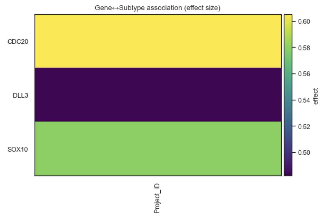
Example Association heatmap
What it does#
Pivots a tidy DataFrame into a wide matrix
Aggregates values when multiple entries map to the same cell
Displays the result as a matplotlib heatmap
Works with any association output (effect sizes, statistics, −log10(q), etc.).
This is a low-level plotting helper, intentionally flexible and minimal.
Parameters#
df
Input DataFrame in tidy (long) format.
index
Column to use as heatmap rows (e.g. “gene”).
columns
Column to use as heatmap columns (e.g. “groupby” or “contrast”).
values
Numeric column to display (e.g. “effect”, “log2FC”, “-log10(qval)”).
agg
Aggregation function used when multiple values map to one cell:
“mean” (default), “max”, or “min”.
cmap
Colormap used for the heatmap.
vmin, vmax
Optional color scale limits.
figsize
Figure size in inches. If None, chosen automatically based on matrix size.
title
Optional plot title.
save
Path to save the figure.
show
Whether to display the plot.
Returns#
(fig, ax)
fig: matplotlib Figure.
ax: matplotlib Axes.
Examples#
Gene × category heatmap (effect size)
bk.pl.association_heatmap(
    df=assoc_df,
    index="gene",
    columns="groupby",
    values="effect",
    cmap="RdBu_r",
)
Use −log10(q-value) for significance
assoc_df["mlog10q"] = -np.log10(assoc_df["qval"])

bk.pl.association_heatmap(
    df=assoc_df,
    index="gene",
    columns="groupby",
    values="mlog10q",
    cmap="viridis",
)
Aggregate by maximum effect
bk.pl.association_heatmap(
    df=assoc_df,
    index="gene",
    columns="groupby",
    values="effect",
    agg="max",
)
When to use this vs other plots#
Plot |
Use case |
|---|---|
association_heatmap |
Flexible, generic matrix visualization |
heatmap_association |
Opinionated summary with top-N filtering |
dotplot_association |
Effect + significance in one plot |
rankplot_association |
Ranked view of strongest associations |
Notes#
No clustering is applied.
Feature ordering follows pivot table output.
Missing combinations appear as empty cells.
This function is designed as a building block for custom association visualizations.
See also#
•	pl.heatmap_association
•	pl.dotplot_association
•	pl.rankplot_association
•	tl.gene_categorical_association
•	tl.obs_categorical_association