Gene Association#
- bullkpy.pl.gene_association(adata, *, gene, groupby, layer='log1p_cpm', kind='violin', order=None, rotate_xticklabels=45, figsize=None, panel_size=(4.2, 3.2), show_points=True, point_size=2.0, point_alpha=0.35, palette='Set2', annotate_posthoc=True, posthoc_method='mwu', posthoc_alpha=0.05, max_brackets=6, bracket_height=0.06, save=None, show=True)[source]#
Gene vs categorical obs association plot (Scanpy-like panels).
gene can be a string or list of genes -> row of panels
violin/box + optional strip points
optional automatic pairwise post-hoc + significance brackets (BH corrected)
Returns (fig, axes).
Gene-vs-category expression plot with optional pairwise post-hoc testing.
This helper makes Scanpy-like panels showing the distribution of one gene (or multiple genes) across the categories of a categorical obs column. It supports violin or box plots, optional jittered points, and optional pairwise post-hoc tests annotated as significance brackets.
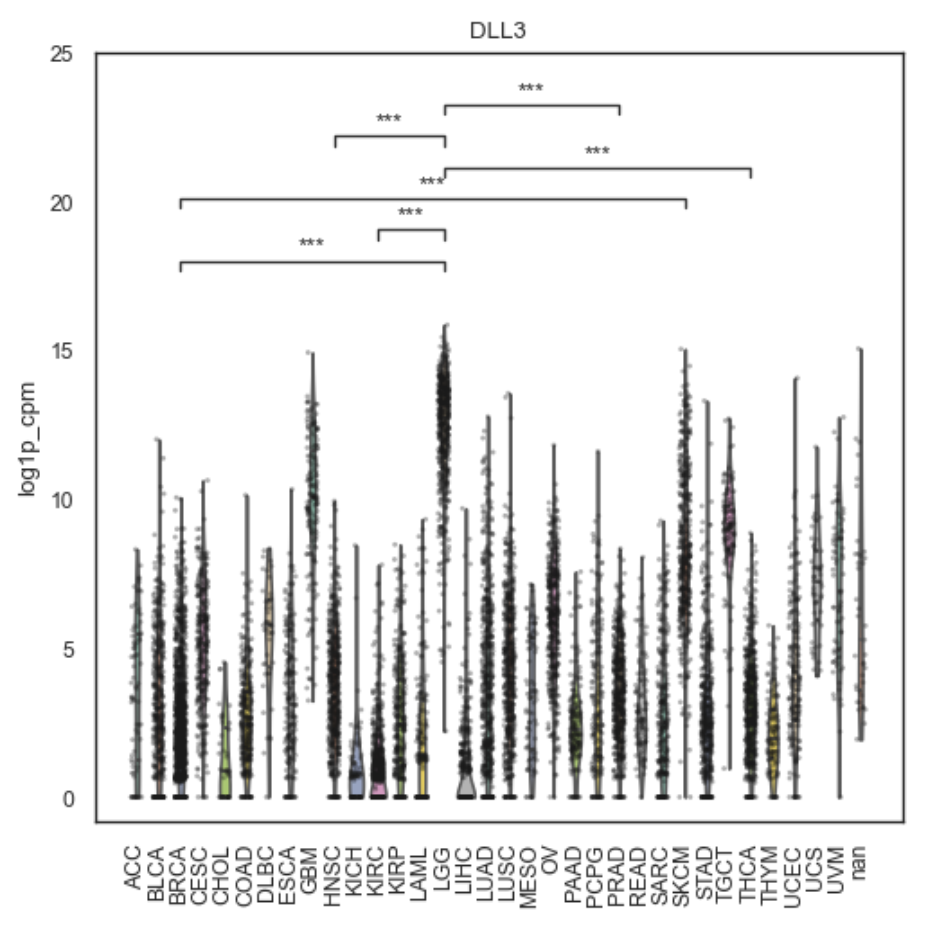
Example Gene Association plot
What it does#
1) Selects groups
Uses
adata.obs[groupby]converted to strings.Category order:
If order is None: uses the categorical order from pd.Categorical(grp).categories
Else: uses order exactly (as strings).
2) Extracts expression for each gene
For each gene panel, it calls: _get_gene_vector(adata, g, layer=layer).
Expression is then plotted per category.
3) Plots distribution per group
Using seaborn:
kind=”violin” →
sns.violinplot(..., cut=0, inner="quartile")kind=”box” →
sns.boxplot(...)
Optional points overlay:
sns.stripplot(..., jitter=0.25, color="k")
Axis formatting:
Title = gene name
y-label = “Expression” if layer is None, else the layer name
x-label removed
tick rotation controlled by rotate_xticklabels
4) Optional post-hoc pairwise tests + brackets
If annotate_posthoc=True and there are ≥2 categories:
Runs pairwise tests with BH correction:
post = pairwise_posthoc(
    df, group_col="grp", value_col="y",
    method=posthoc_method, correction="bh"
)
Adds significance brackets for the most significant comparisons:
_add_brackets(
    ax, post,
    order=cats,
    alpha=posthoc_alpha,
    max_brackets=max_brackets,
    bracket_height=bracket_height,
)
If post-hoc annotation fails for a gene, it emits a warning and continues plotting.
Parameters#
Required#
adata
AnnData object containing expression and metadata.
gene
str or sequence of strings. If multiple genes are provided, a row of panels is created.
groupby
Categorical adata.obs key defining groups on the x-axis.
Expression source#
layer
Layer name to pull expression from. If None, _get_gene_vector should fall back to adata.X.
Plot controls#
kind
“violin” (default) or “box”.
order
Explicit category order for groupby. Useful for controlling display order.
rotate_xticklabels
Rotation (degrees) for x tick labels (default 45).
figsize
Full figure size. If None, computed as (panel_size[0] * n_genes, panel_size[1]).
panel_size
Per-panel size used when figsize=None.
palette
Seaborn palette name (default “Set2”).
Points overlay#
show_points
Add jittered points with stripplot.
point_size, point_alpha
Styling for points.
Post-hoc annotation#
annotate_posthoc
If True, compute all pairwise comparisons and add brackets.
posthoc_method
“mwu” (Mann–Whitney U, two-sided) or “ttest” (Welch t-test), passed to pairwise_posthoc.
posthoc_alpha
Significance threshold on BH-adjusted qval used for bracket display.
max_brackets
Maximum number of brackets to draw per panel (prevents clutter).
bracket_height
Vertical spacing factor for bracket stacking.
Output controls#
save
If provided, saves the figure to this path.
show
If True, calls plt.show().
Returns#
(fig, axes)
fig: Matplotlib Figure
axes: np.ndarray of Axes (even if only one gene).
Output interpretation#
Each panel shows the distribution of expression across groups.
If post-hoc is enabled, brackets indicate significant pairwise differences:
computed with pairwise_posthoc(…)
corrected with Benjamini–Hochberg (BH/FDR)
displayed for comparisons with qval <= posthoc_alpha (up to max_brackets)
Notes / tips#
Use a comparable expression layer (e.g. “log1p_cpm”) if you want interpretability across samples.
For many categories, consider setting max_brackets lower (e.g. 3–5) to keep the plot readable.
If you want a robust comparison against outliers, prefer posthoc_method=”mwu”.
Examples#
Single gene
fig, axes = bk.pl.gene_association(
    adata,
    gene="DLL3",
    groupby="Subtype",
    layer="log1p_cpm",
    kind="violin",
)
Multiple genes in one row
fig, axes = bk.pl.gene_association(
    adata,
    gene=["ASCL1", "NEUROD1", "POU2F3", "YAP1"],
    groupby="Subtype",
    layer="log1p_cpm",
    panel_size=(4.0, 3.2),
)
Enforce category order + Welch t-test posthoc
fig, axes = bk.pl.gene_association(
    adata,
    gene="SOX10",
    groupby="Subtype",
    order=["Luminal", "Basal", "NE-like"],
    posthoc_method="ttest",
    posthoc_alpha=0.01,
    max_brackets=4,
)