PCA scatter plot#
- bullkpy.pl.pca_scatter(adata, *, basis='X_pca', components=(1, 2), color=None, layer='log1p_cpm', point_size=20.0, alpha=0.85, figsize=(6.5, 5.0), title=None, palette='Set1', cmap='viridis', highlight=None, grey_color='#D3D3D3', key='pca', save=None, show=True)[source]#
Scanpy-like PCA scatter plot.
- color can be:
None
obs column (categorical or numeric)
gene name (continuous)
list of any of the above -> multiple panels in one row
highlight (categoricals): show only selected classes in color, all others grey.
PCA scatter plot for samples (observations) stored in an AnnData object.
Supports coloring by metadata (adata.obs), gene expression (adata.var_names),
or multiple color panels in a single row.
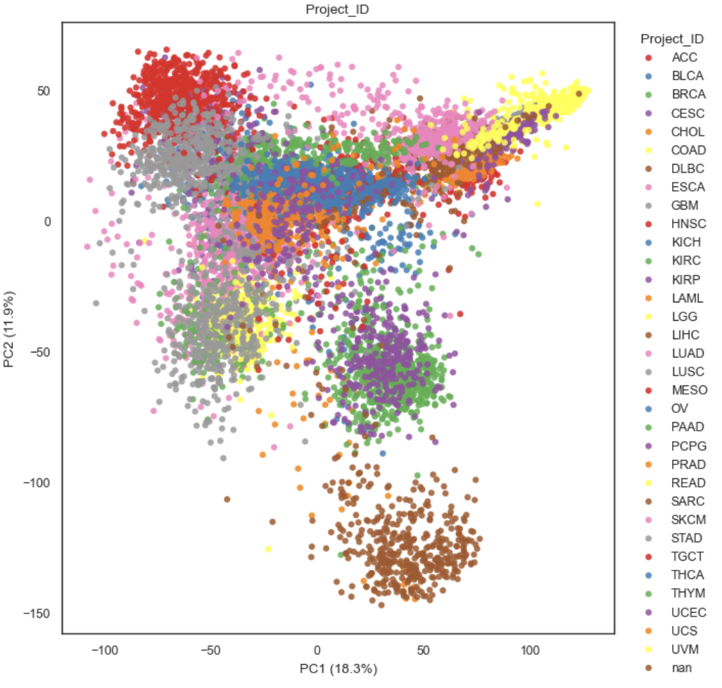
Example PCA scatter plot
What it does#
Reads PCA coordinates from adata.obsm[basis] (default: “X_pca”).
Plots the selected principal components (components, 1-based indexing).
Optionally colors points by:
Nothing (plain scatter)
An obs column (adata.obs[color]) — categorical (legend) or numeric (colorbar)
A gene name in adata.var_names — continuous expression colored from layer
A list of any of the above — produces multiple panels in one row.
For categorical colors, optionally highlights only selected categories and greys out the rest.
Requirements#
adata.obsm[basis]must exist (e.g. after runningbk.tl.pca(adata)).If color is a gene, it must exist in a
data.var_names.If layer is provided for gene coloring, it should exist in
adata.layers[layer](the underlying helper _get_gene_vector decides how to fetch values).
Parameters#
Embedding selection#
basis (str, default “X_pca”). Key in adata.obsm that contains PCA coordinates with shape (n_obs, n_comps).
components (tuple[int, int], default (1, 2)).
Which PCs to plot as (PCx, PCy), 1-based.
Example: (1, 3) plots PC1 vs PC3.
key (str, default “pca”).
Used by _pc_label(…) to build axis labels (typically includes explained variance
if stored in adata.uns[key]).
Coloring#
color (str | list[str] | None, default None). Controls point coloring. Each entry can be:
None → plain scatter
an obs column name (categorical or numeric) → legend or colorbar
a gene name in
adata.var_names→ continuous expression colormap If a list is provided, one panel is drawn per entry.
layer (str | None, default “log1p_cpm”)
Expression layer used only when coloring by gene.
palette (str, default “Set1”).
Palette name for categorical obs coloring.
cmap (str, default “viridis”).
Colormap name for continuous coloring (numeric obs or gene expression).
highlight (str | list[str] | None, default None).
Categorical-only behavior: plot all non-highlight samples in grey_color,
and plot only the requested categories in color with a legend titled
“{color} (highlight)”.
grey_color (str, default “#D3D3D3”). Color used for non-highlight samples in highlight mode.
Point styling#
point_size (float, default 20.0).
Marker size passed to matplotlib.scatter.
alpha (float, default 0.85).
Marker transparency.
Figure / output#
figsize (tuple[float, float], default (6.5, 5.0)).
Base figure size for a single panel.
If color is a list, the function scales width as figsize[0] * n_panels.
title (str | None, default None).
If a single panel, uses this title.
If multiple panels, titles default to “PCA” (for None) or the color key.
save (str | Path | None, default None). If provided, saves the figure via _savefig(fig, save).
show (bool, default True). If True, calls `plt.show().
Behavior details#
Axis labels.
X-axis label is computed by _pc_label(adata, pcx, key=key)
Y-axis label is computed by _pc_label(adata, pcy, key=key)
This typically yields labels like PC1 / PC2, optionally with variance explained.
Multiple panels.
If color=[“Subtype”, “Batch”, “SOX10”]:
creates a 1×3 layout
each panel uses the same PCA coordinates but different coloring.
**Categorical highlighting
If color=”Subtype” and highlight=[“Basal”, “Luminal”]:
all samples are first plotted in grey
only the highlighted categories are overplotted in color + legend
Returns#
fig (matplotlib.figure.Figure)
axes (list[matplotlib.axes.Axes]). A list even for a single panel.
Examples#
Plain PCA scatter
bk.pl.pca_scatter(adata)
Color by a categorical obs column
bk.pl.pca_scatter(adata, color="Subtype")
Color by a gene (expression from a layer)
bk.pl.pca_scatter(adata, color="SOX10", layer="log1p_cpm")
Multi-panel view
bk.pl.pca_scatter(adata, color=["Subtype", "Batch", "MKI67"])