Violin plots#
- bullkpy.pl.violin(adata, *, keys, groupby, layer='log1p_cpm', figsize=(8, 4), panel_size=None, show_points=True, point_size=2.0, point_alpha=0.35, palette=None, order=None, rotate_xticks=45, inner='quartile', cut=0.0, save=None, show=True)[source]#
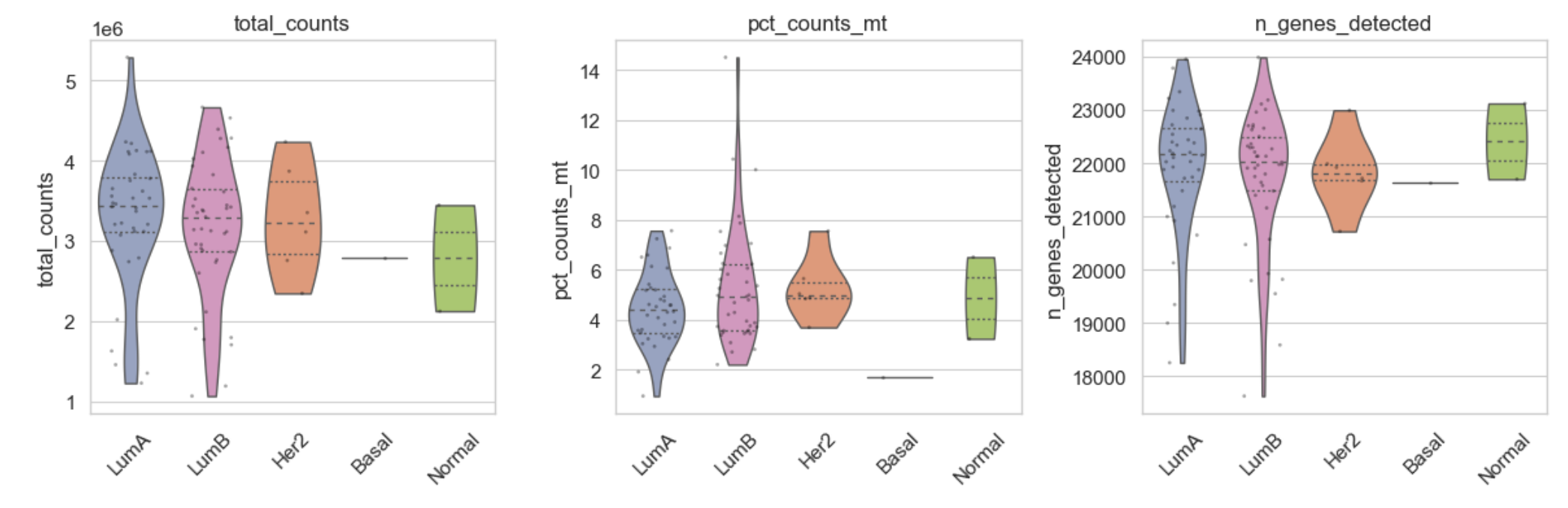
Violin plots of sample-level variables and/or gene expression across groups.
Notes
Each entry in
keysis interpreted as anadata.obscolumn if present, otherwise as a gene inadata.var_names.Gene expression is taken from
layer(oradata.Xiflayer=None).
Use bk.pl.violin to plot QC/clinical variables from adata.obs or gene expression
(from adata.var_names) across groups.
Example violin plot showing gene expression across tumor types.
Basic usage#
bk.pl.violin(
    adata,
    keys=["CDC20", "ASCL1", "CD3D"],
    groupby="Project_ID",
    figsize=(10, 3),
)
Parameters#
adata
AnnData object with samples in .obs and genes in .var_names.
keys
List of variables to plot. Each key can be either:
- name of a column in adata.obs (QC/clinical/signature scores), or
- a gene name found in adata.var_names (expression will be taken from layer).
groupby
Categorical column in adata.obs used to define groups on the x-axis.
layer
Layer to use for gene expression keys (default: "log1p_cpm").
If None, uses adata.X.
figsize
Base figure size (width, height) in inches.
If multiple keys are provided, the final width is scaled by the number of panels.
panel_size
Alternative to figsize: size per panel (width, height) in inches.
If provided, overrides figsize.
show_points
Whether to overlay individual samples as points (strip plot).
point_size
Point size for the overlaid samples.
point_alpha
Transparency for the overlaid points.
palette
Categorical palette name (matplotlib/seaborn). If None, uses global defaults.
order
Explicit order of categories for groupby. If None, uses category order in adata.obs[groupby].
rotate_xticks
Rotation angle (degrees) for x-axis tick labels.
inner
Passed to seaborn.violinplot(inner=...) (e.g. "quartile", "box", None).
cut
Passed to seaborn.violinplot(cut=...).
save
If provided, path to save the figure.
show
If True, displays the plot (matplotlib plt.show()).
Returns#
fig
    Matplotlib Figure.
axes
    Array/list of Axes for each panel.
Notes#
If
groupbyis numeric with many unique values, consider converting it to a categorical.For gene keys, missing genes are ignored/raised depending on implementation; see error message.
See Also#
`bullkpy.pl.gene_association` : association tests for genes vs categories
`bullkpy.tl.score_genes      : compute signature scores for plotting in violin
Examples#
# QC variables:
bk.pl.violin(adata, keys=["total_counts", "pct_counts_mt"],
    groupby="Project_ID".
)

# Gene expression:
bk.pl.violin(adata, keys=["DLL3", "SOX10"],
    groupby="Subtype_PAM50",
    layer="log1p_cpm",
)
```{figure} /_static/violin_genes_example.png
:alt: Violin plot example
:width: 800px
:align: center
#Control category order and tick rotation: bk.pl.violin( adata, keys=[“CDC20”], groupby=”Project_ID”, order=[“LUAD”, “LUSC”, “BRCA”], otate_xticks=90, )
## Notes

- If a key is found in `adata.obs`, it is treated as metadata.
- If a key is found in `adata.var_names`, expression is extracted from `layer`.
- Supports mixed metadata + genes in a single call.