Correlation plot#
- bullkpy.pl.corrplot(adata, *, x, y, x_source='auto', y_source='auto', color=None, hue=None, layer=None, palette='tab20', cmap='viridis', legend=True, method='both', add_regline=True, annotate=True, dropna=True, point_size=18.0, alpha=0.75, figsize=(5.5, 4.5), panel_size=None, title=None, save=None, show=True)[source]#
Scatter + correlations between two quantitative vectors. Correlation scatter plot between two vectors.
x and y can be: - obs columns - genes (from X or layer)
Supports: - obs vs obs - gene vs gene - gene vs obs
Examples
# gene vs gene bk.pl.corrplot(adata, x=”MKI67”, y=”TOP2A”, x_source=”gene”, y_source=”gene”, layer=”log1p_cpm”)
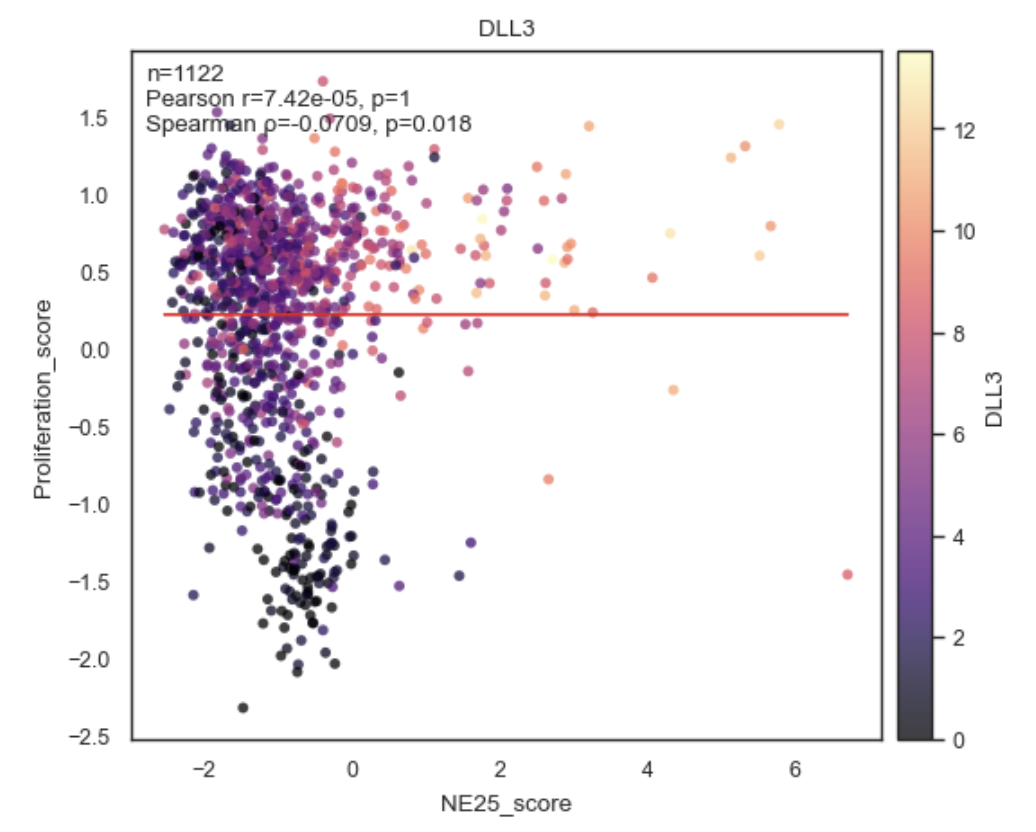
# gene vs obs bk.pl.corrplot(adata, x=”MKI67”, y=”Proliferation_score”, x_source=”gene”, y_source=”obs”)
# obs vs obs (auto) bk.pl.corrplot(adata, x=”mp_entropy”, y=”purity”)
Scatter plot and correlation analysis between two numeric arrays including gene versus gene, gene versus numeric observation (obs) column or correlation plot between two numeric observations, with optional coloring, regression lines, and multi-panel layout.
This function is designed for exploratory QC and association analysis at the sample/observation level, similar in spirit to Scanpy/Seaborn correlation plots but tightly integrated with AnnData.
Example Correlation Plot between Obs.
Purpose#
corrplot_obs visualizes the relationship between two quantitative adata.obs columns and computes correlation statistics:
Pearson correlation
Spearman correlation
Or both (default).
It supports:
Coloring by additional obs variables
Multiple panels in a single figure
Optional regression lines
Inline annotation of correlation coefficients and p-values
Parameters#
adata
Annotated data matrix (AnnData).
x, y
Names of genes or numeric columns in adata.obs to correlate.
Both are coerced to numeric (pd.to_numeric(errors=”coerce”)).
x_source, y_source
“Gene” or “obs” or leave as “auto”
color
Optional coloring variable(s) from adata.obs.
None → single uncolored scatter
str → color points by this obs column
Sequence[str] → create one panel per color key
Example:
color=["Batch", "Subtype"]
hue
Alias for color (Scanpy/Seaborn-style convenience). e.g. “CDC20” for gene expression.
If provided and color=None, hue is used.
layer
Included for API consistency; not used directly since this function operates on obs, not expression layers.
palette
Color palette for categorical coloring.
Default: “tab20”.
cmap
Colormap for numeric coloring.
Default: “viridis”.
legend
Whether to show a legend when coloring by categorical variables.
method
Which correlation(s) to compute and annotate:
“pearson”
“spearman”
“both” (default)
add_regline
If True, adds a least-squares regression line to each panel.
annotate
If True, annotates each panel with correlation statistics (r, p, n).
dropna
Whether to drop rows with NA in x or y before plotting.
Highly recommended (True by default).
point_size
Marker size for scatter points.
alpha
Transparency of scatter points.
figsize
Base figure size for a single panel.
If multiple panels are drawn, width is multiplied automatically unless panel_size is given.
panel_size
Explicit size (width, height) per panel.
Overrides figsize scaling when multiple panels are used.
title
Optional plot title
Applied to the figure if single panel
Ignored for multi-panel plots (to avoid repetition)
save
Path to save the figure (any format supported by Matplotlib).
show
Whether to display the figure via plt.show().
Returns#
(fig, axes, stats)
fig: Matplotlib Figure
axes: NumPy array of Axes (one per panel)
stats List of dictionaries, one per panel, containing correlation results:
{
  "pearson_r": float,
  "pearson_p": float,
  "spearman_r": float,
  "spearman_p": float,
  "n": int
}
(Exact keys depend on method.)
Behavior details#
Multi-panel mode
If color is a list, one panel is created per color key:
bk.pl.corrplot_obs(
    adata,
    x="libsize",
    y="pct_mito",
    color=["Batch", "Subtype"]
)
Two panels in one row, same x/y, different coloring.
Coloring rules
Numeric color: continuous colormap + colorbar
Categorical color: discrete palette + legend
No color: plain scatter
Correlation computation
Correlations are computed after NA filtering
Sample size (n) reflects valid points only
Pearson and Spearman are computed independently
Examples#
Basic correlation plot
bk.pl.corrplot_obs(
    adata,
    x="libsize",
    y="n_genes"
)
Colored by batch
bk.pl.corrplot_obs(
    adata,
    x="libsize",
    y="pct_mito",
    color="Batch"
)
Multiple panels
bk.pl.corrplot_obs(
    adata,
    x="libsize",
    y="pct_mito",
    color=["Batch", "Subtype"],
    panel_size=(5, 4)
)
Spearman only, no regression line
bk.pl.corrplot_obs(
    adata,
    x="score_A",
    y="score_B",
    method="spearman",
    add_regline=False
)
Notes#
Requires at least 3 valid observations after filtering
Intended for obs–obs correlations
For gene–obs or gene–gene correlations, use:
gene_gene_correlations
top_gene_obs_correlations
plot_corr_scatter
See also#
•	bk.pl.plot_corr_scatter
•	bk.tl.obs_obs_corr_matrix
•	bk.tl.top_obs_obs_correlations
•	bk.pl.plot_corr_heatmap