Dotplot#
- bullkpy.pl.dotplot(adata, *, var_names=None, var_groups=None, obs_names=None, obs_groups=None, use_obs=False, groupby='leiden', layer='log1p_cpm', fraction_layer='counts', expression_cutoff=0.0, mean_only_expressed=False, expr_threshold=None, standard_scale=None, swap_axes=False, row_spacing=1.0, dendrogram_top=False, dendrogram_rows=False, row_dendrogram_position='right', cluster_rows=None, cluster_cols=None, cmap='Reds', vmin=None, vmax=None, dot_min=None, dot_max=None, size_exponent=1.5, gamma=None, smallest_dot=0.0, largest_dot=200.0, scale_dots_to_fig=True, dot_scale=1.0, x_padding=0.8, y_padding=1.0, figsize=None, invert_yaxis=True, title=None, size_title='Fraction of samples\nin group (%)', colorbar_title='Mean expression\nin group', size_obs_key=None, size_clip=None, save=None, show=True)[source]#
Dotplot like Scanpy (0.5-centered coordinates, dot scaling, minmax standard_scale), with BULLKpy additions:
can plot var genes OR numeric adata.obs columns (use_obs=True)
dot sizes can auto-scale to figsize/axes (scale_dots_to_fig=True)
optional dendrograms (top + rows)
optional size encoding from an obs column (size_obs_key)
Scanpy-like dot plot summarizing mean expression and fraction of expressing samples for a set of genes across categorical groups.
Each dot represents a (group × gene) combination:
Dot color → mean expression in the group (from
layer)Dot size → fraction of samples in the group with expression above
expr_threshold(fromfraction_layer, default rawcounts)
This is bulk-friendly: groups are sets of samples (obs), not single cells.
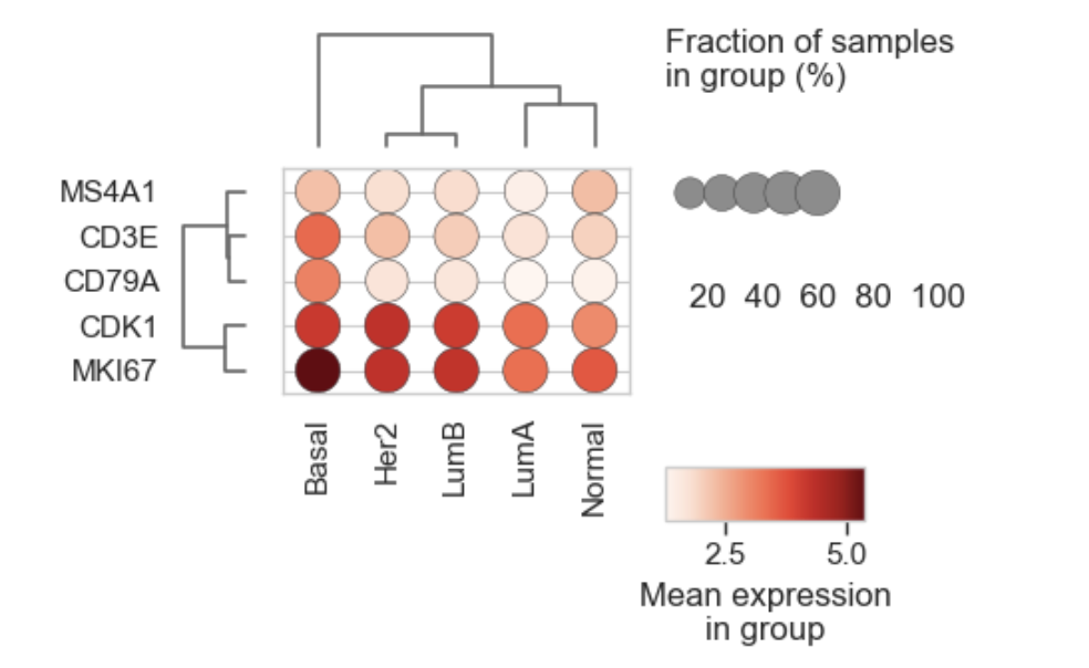
Example Dotplot for bulk RNAseq
What it does#
Given groups G (categories of groupby) and genes V:
Mean expression (color)
For each group g and gene v:
[
\text{mean_expr}(g,v) = \frac{1}{|g|}\sum_{i \in g} X_{\text{mean}}[i,v]
]
where X_mean comes from:
adata.layers[layer]if availableotherwise
adata.X
Fraction expressing (size)
[
\text{frac_expr}(g,v) = \frac{1}{|g|}\sum_{i \in g} \mathbb{1}(X_{\text{frac}}[i,v] > \text{expr_threshold})
]
where X_frac comes from:
adata.layers[fraction_layer] if available
otherwise falls back to X_mean.
By default this uses raw-ish counts (fraction_layer=”counts”) so the “expressing fraction” is meaningful.
Parameters#
Gene selection#
var_names
List of gene names to plot (must exist in adata.var_names).
var_groups
Optional dict of named gene groups:
var_groups={
  "NE markers": ["ASCL1","CHGA","SYP"],
  "Lineage": ["SOX2","SOX9"]
}
If provided, genes are concatenated in the dict order and override var_names.
Grouping#
groupby
How to define groups:
str: a single categorical adata.obs[groupby]
Sequence[str]: multiple obs columns combined into one composite key: “A | B | C” per sample.
Expression sources#
layer
Matrix used to compute mean expression (dot color).
Default: “log1p_cpm”.
Set layer=None to use adata.X.
fraction_layer
Matrix used to compute fraction expressing (dot size).
Default: “counts”.
If the layer is missing, it falls back to layer/X.
expr_threshold
Threshold applied to fraction_layer to decide whether a sample “expresses” a gene.
Default: 0.0 (strictly greater than 0).
Scaling / normalization (for display)#
standard_scale
Optional z-scoring of the displayed color matrix (mean_expr) before plotting:
“var”: z-score per gene across groups (highlight group-specific expression)
“group”: z-score per group across genes (highlight marker structure within a group)
None: no scaling (raw means)
Axes / layout#
swap_axes
If False (default):
rows = groups
cols = genes.
If True:
rows = genes
cols = groups.
invert_yaxis If True (default), top row is first item (Scanpy-like).
row_spacing
Shrinks the vertical panel height to reduce empty space between rows.
Useful for large dotplots or long labels.
Clustering & dendrograms#
dendrogram_top
If True, draws a dendrogram above columns (requires SciPy).
dendrogram_rows
If True, draws a dendrogram along rows (requires SciPy).
row_dendrogram_position
Where to place the row dendrogram:
“right” (default)
“left”
“outer_left” (extra margin).
cluster_rows, cluster_cols
Whether to cluster rows/columns (hierarchical clustering on the display matrix).
If None, defaults to the corresponding dendrogram flag:
cluster_rows = dendrogram_rows
cluster_cols = dendrogram_top
Clustering uses:
linkage(…, method=”average”, metric=”euclidean”)
Color and size mapping#
cmap, vmin, vmax
Colormap and limits for dot color (mean expression after optional scaling).
If vmin/vmax not provided, min/max of the displayed matrix are used.
dot_min, dot_max
Clamp fraction values before size scaling.
Defaults: [0.0, 1.0].
gamma
Nonlinear scaling for dot sizes (power transform).
< 1 expands small fractions
If > 1 compresses small fractions.
Default: 0.5 (makes small fractions more visible).
smallest_dot, largest_dot
Dot size range (Matplotlib “s” units).
Defaults: 12 to 260.
Titles and output#
title
Figure title.
size_title
Text label for the dot-size legend.
colorbar_title
Text label for the colorbar.
save
Path to save the figure.
show
Whether to call plt.show().
Returns#
(fig, ax)
fig: Matplotlib Figure
ax: main dotplot Axes (not the dendrogram/legend axes).
Examples#
Basic dotplot (groups = leiden clusters)
bk.pl.dotplot(
    adata,
    var_names=["ASCL1","NEUROD1","POU2F3","YAP1"],
    groupby="leiden",
)
Use gene groups + z-score per gene
bk.pl.dotplot(
    adata,
    var_groups={
        "NE": ["ASCL1","CHGA","SYP"],
        "Non-NE": ["POU2F3","YAP1"],
    },
    groupby="Subtype",
    standard_scale="var",
)
Swap axes + cluster rows/cols
bk.pl.dotplot(
    adata,
    var_names=marker_genes,
    groupby="Subtype",
    swap_axes=True,
    dendrogram_top=True,
    dendrogram_rows=True,
)
Fraction based on a different layer + stricter threshold
bk.pl.dotplot(
    adata,
    var_names=["MKI67","TOP2A"],
    groupby="Subtype",
    layer="log1p_cpm",
    fraction_layer="counts",
    expr_threshold=5,
)