Correlation plot Observations#
- bullkpy.pl.corrplot_obs(adata, *, x, y, color=None, hue=None, layer=None, palette='tab20', cmap='viridis', legend=True, method='both', add_regline=True, annotate=True, dropna=True, point_size=18.0, alpha=0.75, figsize=(5.5, 4.5), panel_size=None, title=None, save=None, show=True)[source]#
Scatter + correlations between two quantitative obs columns.
- Multi-panel:
color=[“DLL3”,”SOX10”] makes one panel per color key in a single row.
Scatter plot and correlation analysis between two numeric observation (obs) columns, with optional coloring, regression lines, and multi-panel layout.
This function is designed for exploratory QC and association analysis at the sample/observation level, similar in spirit to Scanpy/Seaborn correlation plots but tightly integrated with AnnData.
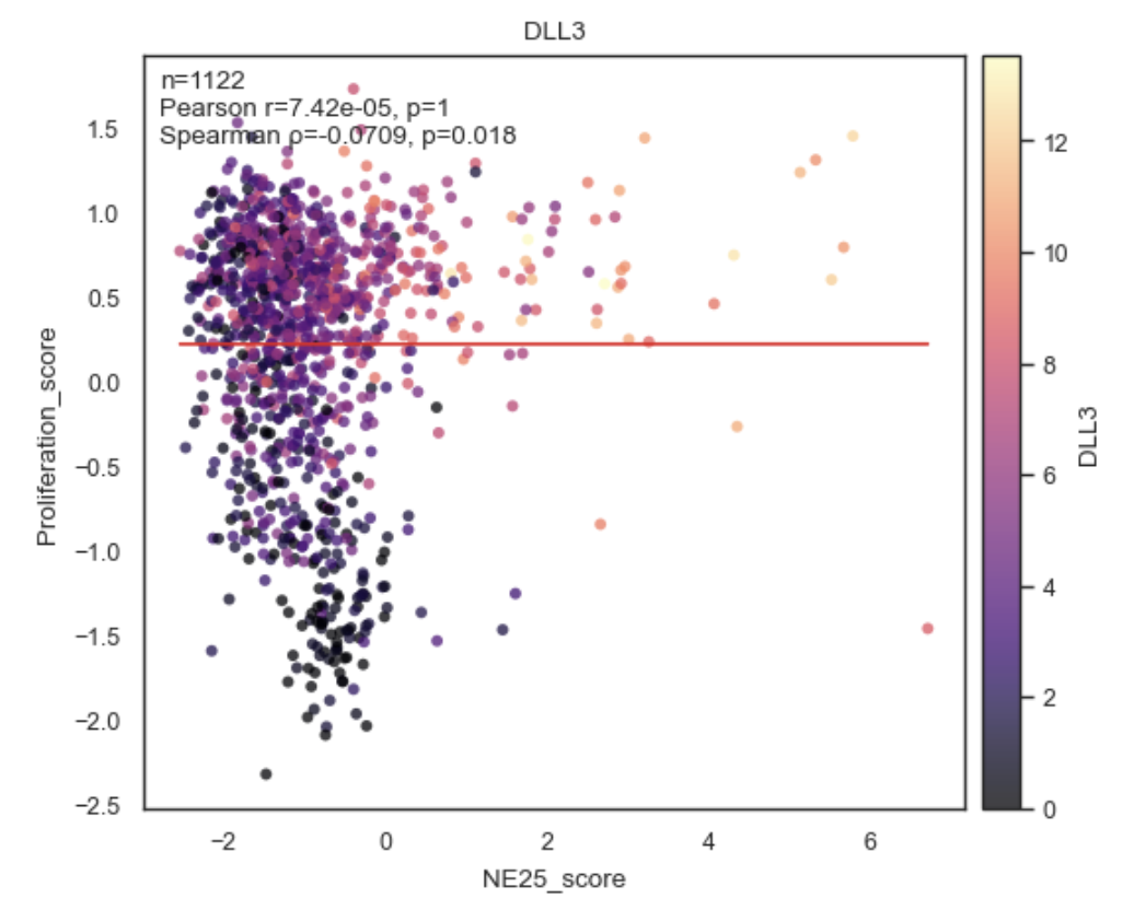
Example Correlation Plot between Obs.
Purpose#
corrplot_obs visualizes the relationship between two quantitative adata.obs columns and computes correlation statistics:
Pearson correlation
Spearman correlation
Or both (default).
It supports:
Coloring by additional obs variables
Multiple panels in a single figure
Optional regression lines
Inline annotation of correlation coefficients and p-values
Parameters#
adata
Annotated data matrix (AnnData).
x, y
Names of numeric columns in adata.obs to correlate.
Both are coerced to numeric (pd.to_numeric(errors=”coerce”)).
color
Optional coloring variable(s) from adata.obs.
None → single uncolored scatter
str → color points by this obs column
Sequence[str] → create one panel per color key
Example:
color=["Batch", "Subtype"]
hue
Alias for color (Scanpy/Seaborn-style convenience).
If provided and color=None, hue is used.
layer
Included for API consistency; not used directly since this function operates on obs, not expression layers.
palette
Color palette for categorical coloring.
Default: “tab20”.
cmap
Colormap for numeric coloring.
Default: “viridis”.
legend
Whether to show a legend when coloring by categorical variables.
method
Which correlation(s) to compute and annotate:
“pearson”
“spearman”
“both” (default)
add_regline
If True, adds a least-squares regression line to each panel.
annotate
If True, annotates each panel with correlation statistics (r, p, n).
dropna
Whether to drop rows with NA in x or y before plotting.
Highly recommended (True by default).
point_size
Marker size for scatter points.
alpha
Transparency of scatter points.
figsize
Base figure size for a single panel.
If multiple panels are drawn, width is multiplied automatically unless panel_size is given.
panel_size
Explicit size (width, height) per panel.
Overrides figsize scaling when multiple panels are used.
title
Optional plot title
Applied to the figure if single panel
Ignored for multi-panel plots (to avoid repetition)
save
Path to save the figure (any format supported by Matplotlib).
show
Whether to display the figure via plt.show().
Returns#
(fig, axes, stats)
fig: Matplotlib Figure
axes: NumPy array of Axes (one per panel)
stats List of dictionaries, one per panel, containing correlation results:
{
  "pearson_r": float,
  "pearson_p": float,
  "spearman_r": float,
  "spearman_p": float,
  "n": int
}
(Exact keys depend on method.)
Behavior details#
Multi-panel mode
If color is a list, one panel is created per color key:
bk.pl.corrplot_obs(
    adata,
    x="libsize",
    y="pct_mito",
    color=["Batch", "Subtype"]
)
Two panels in one row, same x/y, different coloring.
Coloring rules
Numeric color: continuous colormap + colorbar
Categorical color: discrete palette + legend
No color: plain scatter
Correlation computation
Correlations are computed after NA filtering
Sample size (n) reflects valid points only
Pearson and Spearman are computed independently
Examples#
Basic correlation plot
bk.pl.corrplot_obs(
    adata,
    x="libsize",
    y="n_genes"
)
Colored by batch
bk.pl.corrplot_obs(
    adata,
    x="libsize",
    y="pct_mito",
    color="Batch"
)
Multiple panels
bk.pl.corrplot_obs(
    adata,
    x="libsize",
    y="pct_mito",
    color=["Batch", "Subtype"],
    panel_size=(5, 4)
)
Spearman only, no regression line
bk.pl.corrplot_obs(
    adata,
    x="score_A",
    y="score_B",
    method="spearman",
    add_regline=False
)
Notes#
Requires at least 3 valid observations after filtering
Intended for obs–obs correlations
For gene–obs or gene–gene correlations, use:
gene_gene_correlations
top_gene_obs_correlations
plot_corr_scatter
See also#
•	bk.pl.plot_corr_scatter
•	bk.tl.obs_obs_corr_matrix
•	bk.tl.top_obs_obs_correlations
•	bk.pl.plot_corr_heatmap