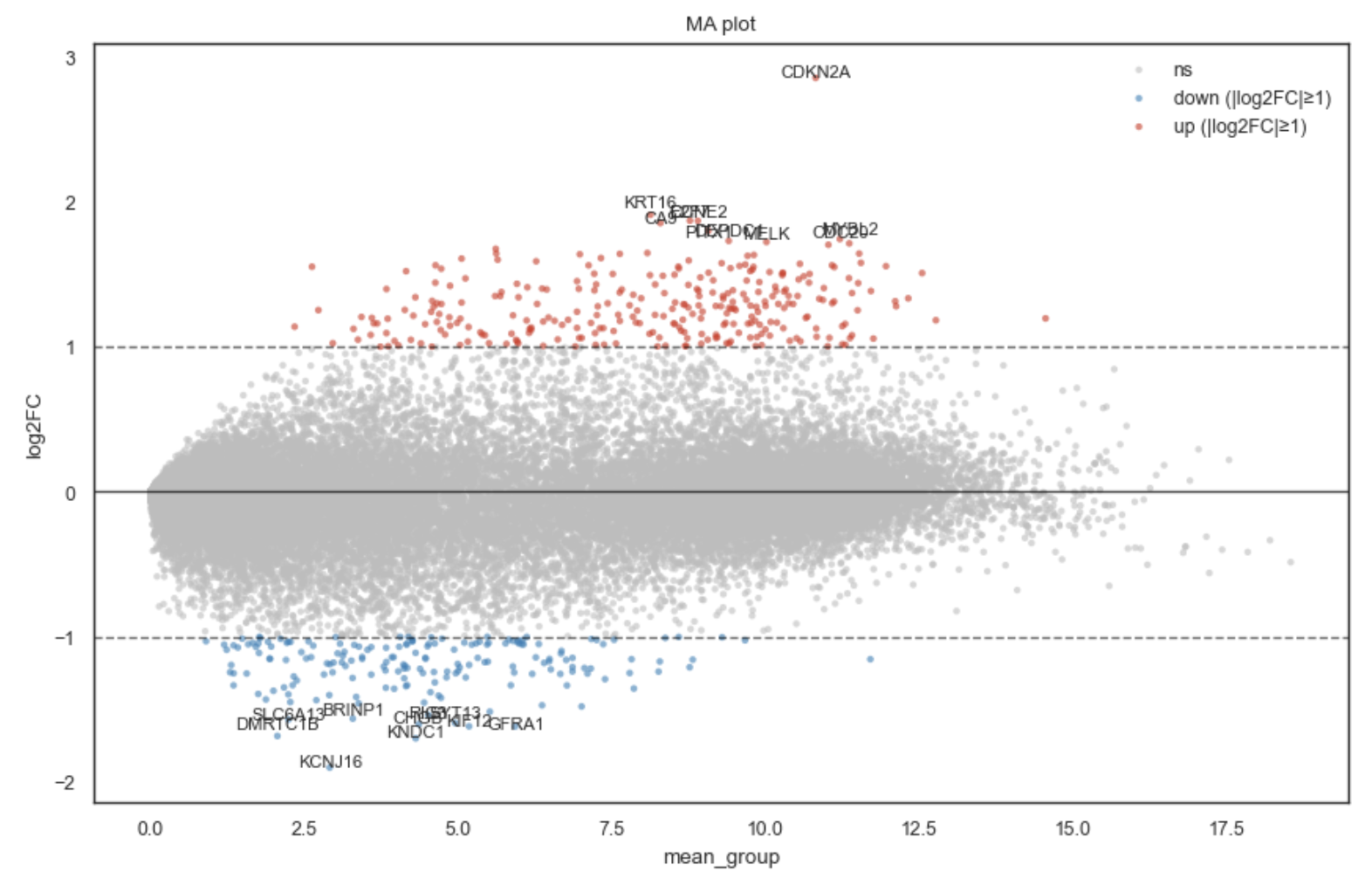
MA plot#
- bullkpy.pl.ma(*, result, mean_col='mean_norm', fc_col='log2FC', gene_col='gene', pval_col='pval', qval_col='qval', alpha=0.05, use_qval=True, min_abs_fc=0.5, show_fc_lines=True, fc_line_kwargs=None, point_size=10.0, point_alpha=0.6, label_genes=(), top_n_labels=10, bottom_n_labels=10, label_only_large_fc=True, title='MA plot', xlabel=None, ylabel=None, figsize=(8.5, 5.5), save=None, show=True)[source]#
MA plot for DE results.
- Colors:
non-significant: grey
significant up (fc >= +min_abs_fc): red
significant down (fc <= -min_abs_fc): blue
Adds automatic FC cutoff lines at ±min_abs_fc (optional).
- Parameters:
result – DataFrame with at least [mean_col, fc_col] and (gene_col recommended).
alpha – Significance threshold on q-value or p-value (see use_qval).
min_abs_fc – Minimum absolute fold-change (in the same units as fc_col, typically log2FC) to consider a gene biologically relevant and to color as up/down.
show_fc_lines – Draw horizontal lines at ±min_abs_fc.
label_genes – Explicit genes to label (if present).
top_n_labels / bottom_n_labels – Additionally label top/bottom genes by fold-change among “relevant” hits (significant + abs(fc) >= min_abs_fc if label_only_large_fc=True).
MA plot for differential expression (DE) results.
An MA plot shows:
x-axis (A): mean expression (e.g. normalized mean across samples)
y-axis (M): fold change (typically
log2FC)
This is especially useful to detect large fold-changes at moderate expression and to spot genes with strong effects that would be missed if you only looked at p-values.
Example bk.pl.ma().
What it does.#
Given a DE results table, this function:
Plots each gene at (mean_col, fc_col)
Classifies genes using both: • statistical significance (qval or pval), and • biological relevance (|log2FC| ≥ min_abs_fc)
Colors points as: • grey: not significant or significant but small effect • red: significant and log2FC ≥ +min_abs_fc • blue: significant and log2FC ≤ −min_abs_fc
Optionally draws automatic horizontal fold-change cutoff lines at ±min_abs_fc
Optionally labels genes: • explicit label_genes • • top/bottom genes by fold-change among “relevant” hits
Required columns.#
Your result dataframe must include:
• mean_col (default: mean_norm)
• fc_col (default: log2FC)
Recommended:
• gene_col (default: gene) for labeling
Significance columns:
• if use_qval=True: expects qval_col (default: qval)
• else: expects pval_col (default: pval)
If no p/q column is available, the function still plots the MA scatter but treats all points as non-significant.
Key parameters#
Significance & effect thresholds#
alpha
Significance cutoff on q-values or p-values (depending on use_qval).
use_qval
If True, use qval_col. If False, use pval_col.
min_abs_fc
Minimum absolute fold-change (same units as fc_col, typically log2FC) to classify
genes as biologically relevant (red/blue).
Fold-change cutoff lines#
show_fc_lines
If True, draws horizontal lines at ±min_abs_fc.
fc_line_kwargs
Optional dict passed to axhline() for the FC cutoff lines (e.g. {“alpha”:0.3, “linestyle”:”-“}).
Labels#
label_genes
Explicit list of genes to label (if present in the table).
top_n_labels / bottom_n_labels
Additionally label the most upregulated / most downregulated genes by fc_col
among the “label pool”.
label_only_large_fc
If True (recommended), labels are selected only among genes that are:
• significant AND abs(fc) >= min_abs_fc
If False, labels can be chosen from significant genes even if fold-change is small.
Returns#
•	fig — matplotlib.figure.Figure
•	ax — matplotlib.axes.Axes
Examples#
Basic MA plot (q-values + fold-change cutoff)#
bk.pl.ma(
    result=res,
    mean_col="mean_norm",
    fc_col="log2FC",
    qval_col="qval",
    use_qval=True,
    alpha=0.05,
    min_abs_fc=0.5,
)
Use p-values instead of q-values#
bk.pl.ma(
    result=res,
    use_qval=False,
    pval_col="pval",
    alpha=0.01,
    min_abs_fc=1.0,
)
Label specific genes + top/bottom hits#
bk.pl.ma(
    result=res,
    min_abs_fc=0.5,
    label_genes=["TP53", "RB1", "DLL3"],
    top_n_labels=8,
    bottom_n_labels=8,
)
Notes.#
•	If your mean_col is on a log scale, that’s OK—MA plots are commonly shown with log mean expression.
•	The default behavior is intentionally effect-size aware: a gene can be statistically significant but remain grey if abs(log2FC) < min_abs_fc.
See also#
•	pl.volcano (p/q vs fold-change)
•	pl.rankplot (top DE genes as bars)