QC by group#
- bullkpy.pl.qc_by_group(adata, *, groupby, keys=('total_counts', 'n_genes_detected', 'pct_counts_mt', 'pct_counts_ribo'), kind='violin', log1p=('total_counts',), figsize=(11, 4), rotate_xticks=45, save=None, show=True, show_n=True)[source]#
Plot QC metrics grouped by a metadata column in adata.obs (e.g. batch, cohort).
Grouped QC metric distribution plots for bulk RNA-seq (or pseudo-bulk) samples.
This function visualizes how standard QC metrics vary across levels of a categorical metadata variable (e.g. batch, cohort, condition), making it easy to detect systematic quality differences between groups.
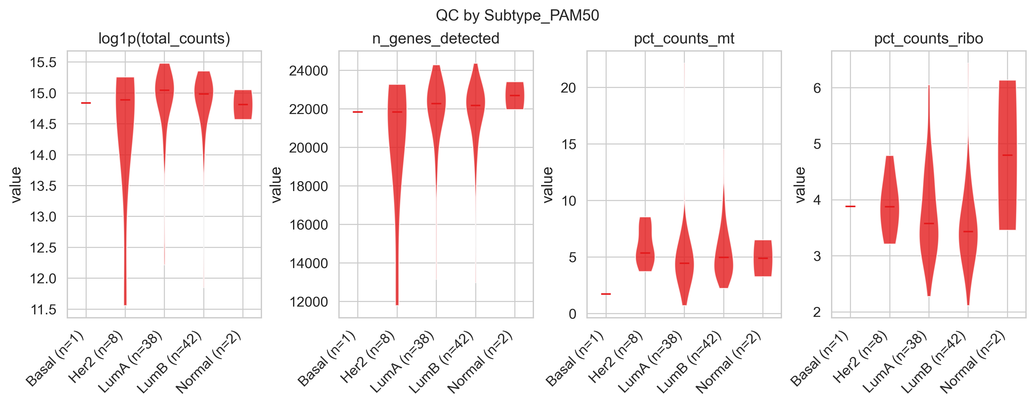
Example QC by group
What it does#
For each QC metric in keys, this function:
Groups samples by adata.obs[groupby].
Plots one panel per metric.
Shows the distribution per group as either:
violins (default), or
boxplots.
Optionally log-transforms selected metrics.
Annotates group labels with sample counts.
This is especially useful for:
Batch effect diagnostics
Comparing cohorts or experimental conditions
Detecting QC-driven confounding before downstream analysis
Requirements#
groupby must be a categorical column in adata.obs
Each entry in keys must exist in adata.obs.
Typically, these metrics are created by:
bk.pp.qc_metrics(adata)
Parameters#
Grouping#
**groupby ** (str, required). Categorical column in adata.obs used to group samples (e.g. “Batch”, “Cohort”, “Platform”).
QC metrics#
keys (Sequence[str], default.
(“total_counts”, “n_genes_detected”, “pct_counts_mt”, “pct_counts_ribo”))
QC metrics to plot, one panel per metric.
Each key must exist in adata.obs.
Plot type#
kind (“violin” | “box”, default “violin”).
Type of distribution plot:
“violin” : shows full distribution shape + median
“box” →: compact summary (quartiles, median).
Transformations#
log1p (Sequence[str], default (“total_counts”,)). Metrics that should be transformed using log1p before plotting.
Useful for highly skewed variables such as library size.
Layout and labels#
figsize (tuple[float, float], default (11, 4)). Overall figure size.
rotate_xticks (int, default 45). Rotation angle for group labels.
show_n (bool, default True). If True, appends sample counts to group labels (e.g. Batch1 (n=24)).
Output#
save (str | Path | None): Path to save the figure. show (bool, default True): If True, calls plt.show().
Returns#
fig (matplotlib.figure.Figure). The figure object.
axes (list[matplotlib.axes.Axes]). One axis per QC metric, in the same order as keys.
Interpretation guide#
Shifted distributions between groups: potential batch or cohort effects.
Higher mt% or lower gene counts in a group: degraded RNA or sample preparation issues.
Broader distributions in one group: increased technical variability.
These plots are most informative before filtering, to guide threshold selection or batch-aware QC decisions.
Examples#
Default QC comparison by batch
bk.pl.qc_by_group(adata, groupby="Batch")
Boxplots instead of violins
bk.pl.qc_by_group(
    adata,
    groupby="Cohort",
    kind="box",
)
Custom metrics and transformations
bk.pl.qc_by_group(
    adata,
    groupby="Platform",
    keys=("total_counts", "pct_counts_mt"),
    log1p=("total_counts",),
)
Save without displaying
bk.pl.qc_by_group(
    adata,
    groupby="Batch",
    save="qc_by_batch.png",
    show=False,
)