QC pairplot#
- bullkpy.pl.qc_pairplot(adata, *, keys=('total_counts', 'n_genes_detected', 'pct_counts_mt'), color='pct_counts_mt', log1p=('total_counts',), point_size=14.0, alpha=0.7, figsize=(8, 8), save=None, show=True)[source]#
Scatter-matrix (pairplot) of QC metrics in adata.obs.
Diagonal: histograms Off-diagonal: scatter plots
Scatter-matrix (pairplot) of QC metrics stored in adata.obs.
This function provides a compact, exploratory overview of how multiple QC metrics relate to each other, helping you quickly identify correlations, outliers, and problematic samples before filtering.
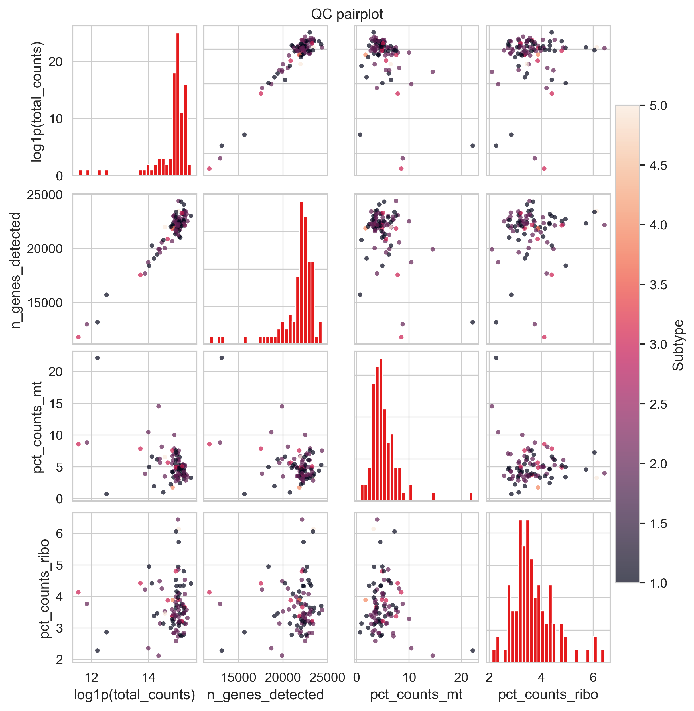
Example QC pair plot
What it does#
For the QC metrics listed in keys, this function creates an n × n grid:
Diagonal panels: Histograms of each QC metric.
Off-diagonal panels: Scatter plots for every pairwise combination of metrics.
Optional coloring: Points can be colored by another QC metric (e.g. mitochondrial fraction).
This plot is particularly useful for:
Detecting correlations (e.g. library size vs detected genes)
Identifying QC-driven outliers
Choosing sensible filtering thresholds
Requirements#
All metrics in keys (and color, if provided) must exist in adata.obs.
Typically these are computed via:
bk.pp.qc_metrics(adata)
Parameters#
QC metrics#
keys (Sequence[str], default.
(“total_counts”, “n_genes_detected”, “pct_counts_mt”)).
QC metrics to include in the pairplot.
Determines both rows and columns of the grid.
Coloring#
color (str | None, default “pct_counts_mt”). Column in adata.obs used to color scatter points.
Must be numeric
If missing, coloring is disabled with a warning
Transformations#
log1p (Sequence[str], default (“total_counts”,)).
Metrics that should be log1p-transformed before plotting.
Useful for highly skewed distributions.
Axis labels are automatically updated to reflect the transformation.
Point appearance#
point_size (float, default 14.0): Marker size for scatter plots.
alpha (float, default 0.7): Marker transparency (helps with overplotting).
Figure options#
figsize (tuple[float, float], default (8, 8)). Overall size of the square figure.
save (str | Path | None).
Path to save the figure.
show (bool, default True)
If True, calls plt.show().
Returns#
fig (matplotlib.figure.Figure): The full figure object.
axes (np.ndarray of matplotlib.axes.Axes). A 2D array of axes with shape (n_keys, n_keys).
Interpretation guide#
Common patterns to look for:
Strong diagonal correlation: total_counts vs n_genes_detected → expected positive relationship. High mt% at low counts/genes: potential low-quality or degraded samples.
Isolated points far from the main cloud: likely QC outliers worth inspecting or filtering.
This plot is best used before hard thresholding, as an exploratory tool.
Examples#
Default QC pairplot
bk.pl.qc_pairplot(adata)
Add more QC metrics
bk.pl.qc_pairplot(
    adata,
    keys=("total_counts", "n_genes_detected", "pct_counts_mt", "pct_counts_ribo"),
)
Disable coloring
bk.pl.qc_pairplot(
    adata,
    color=None,
)
Save without displaying
bk.pl.qc_pairplot(
    adata,
    save="qc_pairplot.png",
    show=False,
)