Sample distances#
- bullkpy.pl.sample_distances(adata, *, layer='log1p_cpm', metric='euclidean', method='average', use='samples', col_colors=None, palette='tab20', z_score=False, figsize=None, show_labels=False, save=None, show=True)[source]#
Sample (or gene) distance clustergram.
Computes pairwise distances (pdist) on X (samples x genes).
Uses seaborn.clustermap with hierarchical clustering.
Optionally annotate samples with metadata columns via col_colors.
Notes
For sample QC, use metric=”correlation” (distance = 1-corr) often works well.
z_score=True will z-score genes across samples before distance computation.
Sample (or gene) distance clustergram using hierarchical clustering and a distance matrix computed from an expression matrix.
This is a QC-style visualization: it shows which samples (or genes) are most similar under a chosen distance metric, and clusters them with linkage-based hierarchical clustering. The plot is rendered with seaborn.clustermap, so you get dendrograms plus a heatmap of pairwise distances.
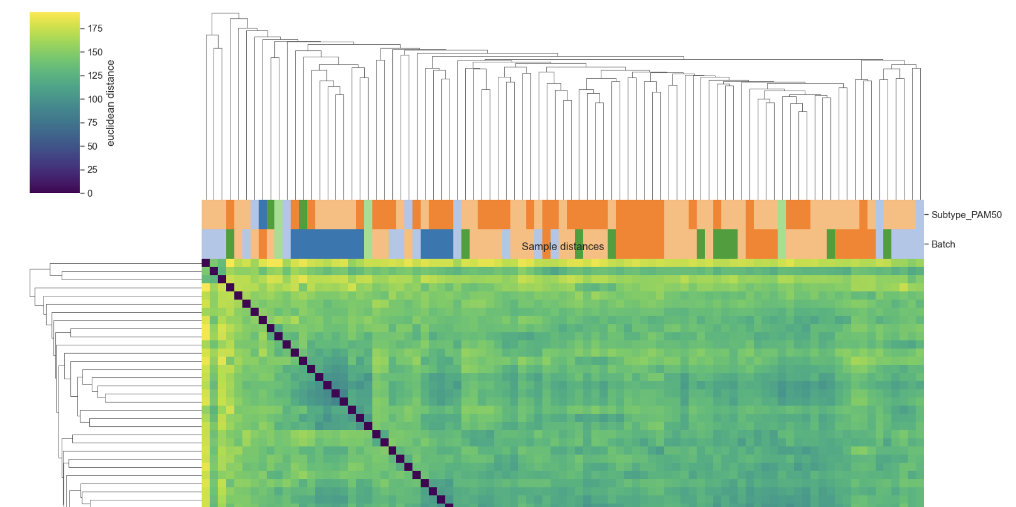
Example Sample distances plot
What it does.#
Fetches a matrix X via _get_matrix(adata, layer=layer, use=use):
use=”samples” → X is samples × genes (rows are samples/obs).
use=”genes” → X is genes × samples or otherwise arranged so that rows correspond to the chosen axis for distance computation (depends on _get_matrix implementation).
Optionally z-scores features across samples (z_score=True):
Z-scoring is applied column-wise: – X = (X - mean(feature)) / std(feature).
This makes distance more about patterns than absolute scale.
Computes pairwise distances using SciPy:
d = pdist(X, metric=metric) → condensed distance vector
D = squareform(d) → full N×N distance matrix.
Builds a labeled DataFrame dfD with:
labels = adata.obs_names if use=”samples” else adata.var_names
dfD is symmetric with zeros on the diagonal.
Performs hierarchical clustering on the condensed distances:
Z = linkage(d, method=method).Plots with seaborn.clustermap:
Uses row_linkage=Z and col_linkage=Z (same clustering for both axes)
Heatmap colormap is fixed to “viridis” (distance scale)
Optional metadata annotations via col_colors when use=”samples”.
(Optional) Adds metadata legends to the right side of the heatmap when col_colors is provided.
Parameters#
Core data / distance#
adata (AnnData): Input object.
layer (str | None, default “log1p_cpm”): Which layer to use for distances.
Passed to _get_matrix.
If None, _get_matrix typically falls back to adata.X (implementation-dependent).
use (“samples” | “genes”, default “samples”):
“samples”: distance among samples (QC use-case).
“genes”: distance among genes (feature similarity / module exploration).
metric (str, default “euclidean”): Distance metric for scipy.spatial.distance.pdist.
Common QC choice: metric=”correlation” (distance = 1 − correlation).
method (str, default “average”): Linkage method for hierarchical clustering (scipy.cluster.hierarchy.linkage).
Common options: “average”, “complete”, “single”, “ward” (ward requires euclidean-like assumptions).
Metadata annotations (samples only)#
col_colors (Sequence[str] | None): List of adata.obs keys used to annotate columns/rows with colored strips.
Only applied when use=”samples”.
Uses _metadata_colors(adata, columns=col_colors, palette=palette) to map categories → colors.
palette (str, default “tab20”): Palette name used for categorical metadata mapping.
Scaling / display#
z_score (bool, default False): If True, z-score features across samples before computing distances.
**figsize ** ((w, h) | None): If None, auto-sized based on n items:
w = max(6.0, min(16.0, 0.18*n + 4.0)), h = w
show_labels (bool, default False): Show axis tick labels (sample names / gene names).
Recommended False for large n.
Output#
save (str | Path | None): If provided, saves using _savefig(cg.fig, save).
show (bool, default True): If True, calls plt.show().
Returns#
cg: seaborn.matrix.ClusterGrid
Access main heatmap axis via cg.ax_heatmap.
Figure via cg.fig.
Requirements / errors#
Requires seaborn (sns) or raises ImportError.
Requires SciPy components: pdist, squareform, and linkage, or raises ImportError.
Notes & best practices#
QC recommendation: try metric=”correlation” for expression-like matrices; it often clusters by expression profiles rather than magnitude.
When to use z_score=True:
Good when genes have very different scales and you care about relative patterns.
Less useful if the layer is already standardized or if absolute magnitude is meaningful.
Metadata annotations: col_colors=[“Subtype”, “Batch”] is a common QC setup to see whether clustering is driven by biology vs batch.
Examples#
Sample QC with correlation distance
bk.pl.sample_distances(
    adata,
    layer="log1p_cpm",
    metric="correlation",
    method="average",
    col_colors=["Subtype", "Batch"],
    show_labels=False,
)
Z-scored Euclidean distances (pattern-focused)
bk.pl.sample_distances(
    adata,
    layer="log1p_cpm",
    metric="euclidean",
    z_score=True,
    col_colors=["Patient"],
)
Gene-gene distance clustergram
bk.pl.sample_distances(
    adata,
    use="genes",
    metric="correlation",
    show_labels=True,
)