Rankplot association#
- bullkpy.pl.rankplot_association(*, res, gene_col='gene', effect_col='effect', sort_by='qval', direction='both', n_items=20, figsize=(7, 6), title=None, save=None, show=True)[source]#
Ranked barplot for categorical association results.
- Behavior mirrors bk.pl.rankplot():
Upregulated / positive = red
Downregulated / negative = blue
Strongest up at top
Most downregulated LAST
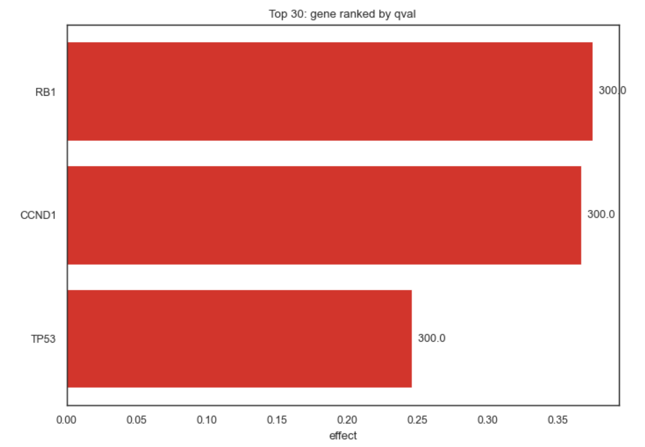
Ranked bar plot for categorical association results.
This function visualizes gene–category association results (e.g. from
gene_categorical_association, rank_genes_categorical, or similar)
as a horizontal ranked bar plot, highlighting the strongest positive
and negative effects.
The behavior mirrors bk.pl.rankplot, but is generalized to arbitrary
association statistics (effect sizes).
Example Rankplot Association
What it does#
Displays ranked effect sizes (e.g. log2FC, η², ε², mean differences)
Uses intuitive coloring: • Red → positive association • Blue → negative association
Ensures consistent ordering: • strongest positive effects at the top • strongest negative effects at the bottom
Supports up-only, down-only, or combined views
This plot is ideal for interpreting categorical association results and for producing publication-ready summaries.
Expected input#
A tidy pandas DataFrame with at least:
column |
description |
|---|---|
gene |
gene or feature name |
effect |
effect size (signed) |
qval / pval |
statistical significance (optional) |
The exact column names are configurable via parameters.
Parameters#
res
DataFrame with association results.
gene_col
Column name identifying genes/features (default: “gene”).
effect_col
Column containing signed effect sizes
(e.g. “log2FC”, “effect_size”, “eta2”).
sort_by
Column used to select top features:
• “qval”
• “pval”
• same as effect_col
direction
Which effects to show:
• “up” → positive effects only
• “down” → negative effects only
• “both” → split between up and down (default)
n_items
Total number of bars to display.
figsize
Figure size in inches.
title
Optional plot title.
save
File path to save the figure (PDF/PNG/SVG).
show
Whether to immediately display the plot.
Returns#
(fig, ax)
fig — matplotlib Figure
ax — matplotlib Axes
Examples#
Rank genes by q-value (default)
bk.pl.rankplot_association(
    res=assoc_df,
    effect_col="effect_size",
    sort_by="qval",
)
Positive associations only
bk.pl.rankplot_association(
    res=assoc_df,
    effect_col="log2FC",
    direction="up",
    n_items=15,
)
Negative associations only
bk.pl.rankplot_association(
    res=assoc_df,
    effect_col="log2FC",
    direction="down",
)
Rank purely by effect size
bk.pl.rankplot_association(
    res=assoc_df,
    effect_col="eta2",
    sort_by="eta2",
    title="Strongest categorical associations",
)
Save figure without displaying
bk.pl.rankplot_association(
    res=assoc_df,
    save="ranked_associations.pdf",
    show=False,
)
Notes#
Effect sizes must be signed for correct up/down coloring.
If sort_by ≠ effect_col, significance is used for selection, but bars are always ordered by effect size.
Designed to work seamlessly with: • gene_categorical_association • rank_genes_categorical • obs_categorical_association
See also#
•	pl.rankplot
•	pl.volcano
•	pl.ma
•	tl.gene_categorical_association